

Monday, November 26, 2012
Protest in film
This is one of my favourite Review covers. At one point it was much more complicated than this and then I started to strip it back .. the more I stripped it back, the more I liked it. I Should've opened the clapper board a bit more and have it cover the masthead a bit but overall I like the vibe. And I love the little hinge.
Sunday, November 25, 2012
Vandalizing artwork
This is always fun, tweaking established artwork to illustrate a story. The first one, The Last Supper, is my favorite. The story was about a huge international christian convention being held in South Africa. 200 Chinese were all booked to go but right as they were leaving they were all detained, passports confiscated or put under house arrest, so we took Da Vinci's The Last Supper and photoshopped several of the disciples out.


This one's cute too. It reminds me off Terry Gilliam's Monty Python animations, mostly because of the lipstick in her hand, I think. (That's some serious kerning on the headline!)
Saturday, November 24, 2012
Weird little photo montage dudes
I quite like these guys. Perhaps not the kind of thing to do all the time but once in a while is fun. That said, I do like to include photo elements and textures in illustrations.
I think they suit the subject tho, film festival, rare books and a guy that tested the claim that Hong Kong is a 24 hour city by going out for a full day and night. I think he's my fav. It's got a clock as a face and for mine the alarm is a nice touch. I figured if he's been up for 24 hours he must've been wired on coffee and the glow sticks for arms - love them.


Friday, November 23, 2012
$US and Time magazine cover
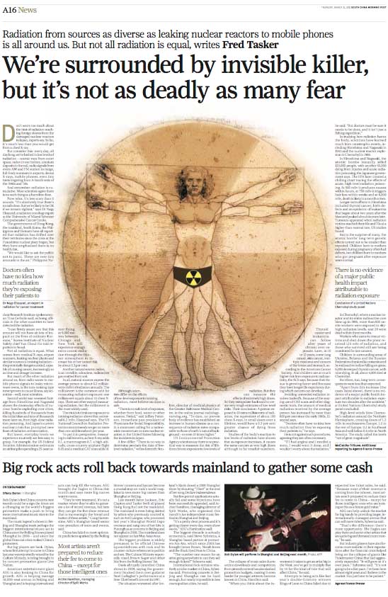
This was an illustration for the South China Morning Post on the decline in value of the US dollar.


A week later I was in a 711 and I looked over at the magazine rack and spotted this. Actually only a portion of the cover was showing but it looked strangely familiar so I went over and fished it out. I couldn't believe it. Took it into work and one of the guys reckon they'd ripped it. Since it was the Asian edition of Time magazine and ours had published on August 3 while theirs was August 15 .. even if you took in account the publishing dateline was 7 days after it hit the shelves that still puts it at August 8. Well I don't know about that, it is the sort of idea that more than one person could come up with. What I did take away from it was, we'd done a Time magazine cover worthy illustration. It's fair to claim that, yeh? And they do awesome covers so I'm happy with that.
Thursday, November 22, 2012

Wednesday, November 21, 2012
Illustrations 5
Some illustrations from 2011
Foreign Aid.


Foreign Aid.
Dissident's kids. The struggles that children of detained mainland dissidents face.
Dissident Lawyers. The broken justice system on the mainland.
Cowboy doctors. I'd already used the cowboy idea for renovators, this time i used it for 'cowboy' doctors. I was really annoyed with myself with this one because i always intended to include spurs and it wasn't until I was on the MTR on my way back home that I realised I'd forgotten them. It still works, I think, but the spurs wld've been a nice touch. Damn.
Green cars. Or more to the point, the failure of the green car initiative - thus the green car/leaves turning into autumn/dead leaves.
I was annoyed by this job. The idea was that the aging leaves were blowing off the tree and cld be randomly be scattered around the page. A designer's dream, right? Instead, the designer first had them falling in a row down the gap in the text .. very un-fluid. I tried to explain what the intention was and he made a few minor adjustments but this was the final result.
He even said to me, 'are you taking the piss?' because I was trying to explain how the page cld be. Am I taking the piss? How about you taking the piss. Not getting it, not listening, not seeing the opportunity. This is a simple idea, reasonably executed, but can be really well designed - instead we get this.
Lose the bubble and the quote, put in a few more falling 'leaves' organically and you have a winner. Epic fail.
Yin Yang. Focus piece on work/life balance - actually, work/life imbalance.
Monday, November 19, 2012
Illustration 4
A few illustrations from 2010
Ringo Starr.


Ringo Starr.
Some more caricatures. Mick Hucknall...
The Electric Eels.
Erland.
Marrianne Faithfull.
Julian Assange ... airing the US's dirty laundry
Mental illness. An illustration on the debilitating effects of mental illness
Illustration 3
A few illustrations for the South China Morning Post from 2009 ...
Unbrainwashing. An article of people have fled North Korea and the 'unbrainwashing' they undergo afterwards


Unbrainwashing. An article of people have fled North Korea and the 'unbrainwashing' they undergo afterwards
Wave. Article on the turbulent job market on the Chinese mainland
Respect. Adolescent males disrespect towards women
Year of the Ox.
Property. Whether to buy and settle roots or rent and have the freedom to move around.
Al Bashir.
Susilo Bambang Yuhoyono.
Saturday, November 17, 2012
Illustrations 2
A collection of illos from 2008 ...
Japanese Brides. Illustrating an article about rural japanese women that become brides to mainland Chinese men and how their life becomes one of almost slavery.


Lisa Minnelli.


Japanese Brides. Illustrating an article about rural japanese women that become brides to mainland Chinese men and how their life becomes one of almost slavery.
Narcism.
Cowboy renovators.
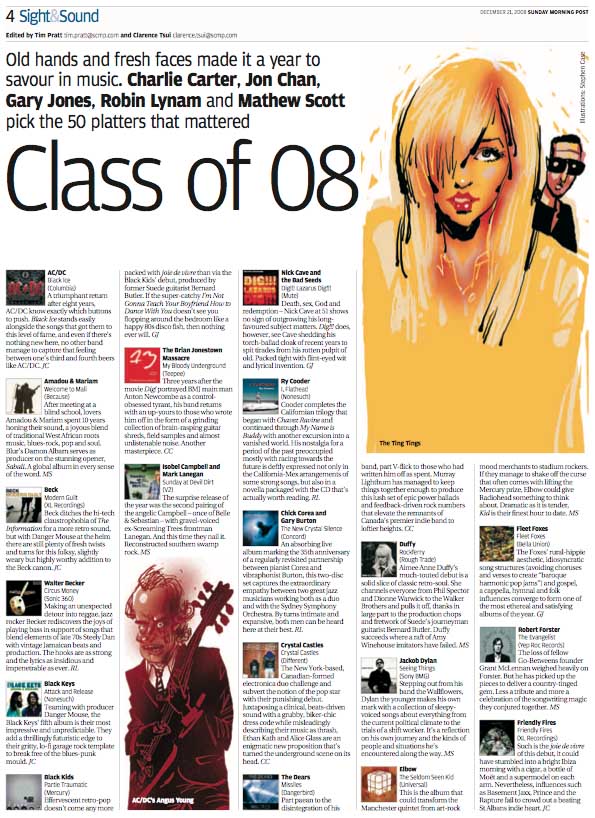
I prefer the caricature of Angus Young over The Ting Tings and would've preferred him to be the hero image.
Battle of the Bands.
Speed kills. I'm quite happy with the spot colour treatment of this page but still prefer the full red in the original illo below.
Illustrations
Since I've only just started this blog I'm going to go retro and dig up some older work. Well not that old .. five years old.
I landed in Hong Kong just before Chinese New Year in February 2007 so that seems like a good place to start. Below are some of the illustrations I was happier with that year.
The gun. This was the first job in HK that I was happy with. Some of the first ones were really ropey. Actually the very first illo I did was so bad i didn't even keep it. Some dodgy Sam Spadesque detective noir attempt that failed on every level other than it was black and white. I binned it as soon as it'd gone to print.
With this one I kept it simple. Simple line work and block color - and chose colours with punch and that wld bounce off each other. I like that the red kicks out off the dark blue.

Bad Bosses. This is the type off illo I like to do. It's quite schizophrenic actually, part line work, part montage, block colour and some airbrush thrown in for good measure. It's also not very subtle, not that i think it needs to be. It's fun tho.


I landed in Hong Kong just before Chinese New Year in February 2007 so that seems like a good place to start. Below are some of the illustrations I was happier with that year.
The gun. This was the first job in HK that I was happy with. Some of the first ones were really ropey. Actually the very first illo I did was so bad i didn't even keep it. Some dodgy Sam Spadesque detective noir attempt that failed on every level other than it was black and white. I binned it as soon as it'd gone to print.
With this one I kept it simple. Simple line work and block color - and chose colours with punch and that wld bounce off each other. I like that the red kicks out off the dark blue.
I was so annoyed when it went to a black and white page though, so here I'm including the original colour version ...
Self Motivation. Again I was annoyed when this one went to a black and white page so here's the colour version too ..
All Blacks.
Bordeaux wines.
The Sevens. Seven artist all drew a team along the lines of the seven deadly sins for the HK rugby sevens in 2007 (it was a 7 theme). Mine was avarice. More specifically, England who'd won it for several years previously and were greedy about winning again.
Post Graduate cover.
Six pack. A very simple illo really. The ring pull belly button makes it for me.
Subscribe to:
Posts (Atom)