Showing posts with label photoshop. Show all posts

Wednesday, August 29, 2018

Frances McDormand as Abby


I guess this won't be the last time I draw Frances McDormand since she turns up in at least six Coen Brother's films. This is her first time working with them - and their first film - as Abby in Blood Simple.
 
More@ Patreon

Tuesday, December 18, 2012

The one that got away

... and ironically it's a mousetrap. 

This was supposed to illustrate a story on a pyramid scheme in Hong Kong where they lure Mainland Chinese in and rip them off. The thing is they went to great lengths to dodge the term pyramid scheme so the feeling was we might get sued if we ran the illo. 

Shame, I was pretty pleased with it.


Monday, December 17, 2012

Saturday, December 8, 2012

Dr Robot

A Health Post cover from a few week's ago for the South China Morning Post. The obvious way to go with this wld be to have a robotic hand holding a scalpel, but I liked the idea of having the stitches as binary code instead .. bit more subtle. The argument against it was that some people might not get it. If I was to come across something that I didn't immediately get, I'd think, "but hang on, someone has published it so it must make sense," and look further. Classic case in point, Gary Larsson. Many times I didn't get Larson at first look but as we all know, with him, there was always a payoff if you put in the time to figure it out.

Health Post also went with my suggested heading, so i was pretty pleased with that too.


Wednesday, December 5, 2012

Internet hate

An illustration for the cover of last weekend's Review in the South China Morning Post. The story was about a film where a woman is persecuted on the internet.


Monday, November 26, 2012

Protest in film

This is one of my favourite Review covers. At one point it was much more complicated than this and then I started to strip it back .. the more I stripped it back, the more I liked it. I Should've opened the clapper board a bit more and have it cover the masthead a bit but overall I like the vibe. And I love the little hinge.


Saturday, November 24, 2012

Weird little photo montage dudes

I quite like these guys. Perhaps not the kind of thing to do all the time but once in a while is fun. That said, I do like to include photo elements and textures in illustrations. 

I think they suit the subject tho, film festival, rare books and a guy that tested the claim that Hong Kong is a 24 hour city by going out for a full day and night. I think he's my fav. It's got a clock as a face and for mine the alarm is a nice touch. I figured if he's been up for 24 hours he must've been wired on coffee and the glow sticks for arms - love them.


Friday, November 23, 2012

$US and Time magazine cover

This was an illustration for the South China Morning Post on the decline in value of the US dollar.


A week later I was in a 711 and I looked over at the magazine rack and spotted this. Actually only a portion of the cover was showing but it looked strangely familiar so I went over and fished it out. I couldn't believe it. Took it into work and one of the guys reckon they'd ripped it. Since it was the Asian edition of Time magazine and ours had published on August 3 while theirs was August 15 .. even if you took in account the publishing dateline was 7 days after it hit the shelves that still puts it at August 8. Well I don't know about that, it is the sort of idea that more than one person could come up with. What I did take away from it was, we'd done a Time magazine cover worthy illustration. It's fair to claim that, yeh? And they do awesome covers so I'm happy with that.


Friday, November 16, 2012

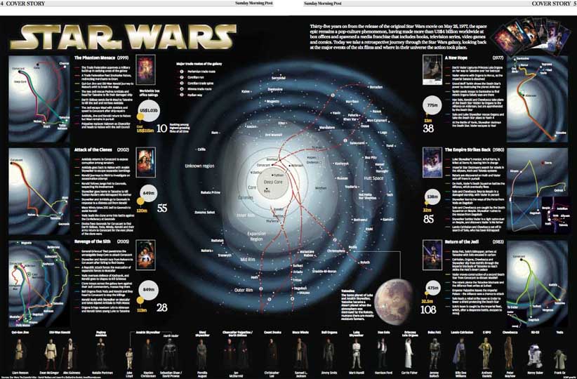
Star Wars

Everyone likes Star Wars, or more to the point everyone likes a Star Wars joke, so this seems like a good place to start. 
Earlier in the year Star Wars turned 35 so for the Review section of the South China Morning Post we did a satire on it for the cover. The idea is it's a faux movie posters but with all the characters aged 35 years. I like the idea of Chewbacca with a bald spot. I don't mind the final result altho I have to say it was funnier in my head than how it actually turned out. Also i'd meant to put glasses on him and it annoyed me when i realised after it'd gone to print that i'd forgotten to. 
It was similar with the whole image. I liked the idea but what was in my head was funnier than what happened on screen. The final thing added was the smoke billowing out the back of the Millennium Falcon. Something was missing and adding that smoke really made the difference. Overall reasonably happy with it. 


Inside, Simon Scarr, with the help of Brian Wang, did a fantastic graphic on the subject. They drew the 'Star Wars galaxy' then showed plot timelines in relation to different areas around this galaxy. V clever and looked fantastic.