This was the cover for the Review for the South China Morning Post on the subject of summer reading.
It actually started off a lot more complicated than this but the more i parred it back the more I liked it. In the end it's really very simple, but I like that it's bold and yet is still quite soft. The shapes are quite loose but I think it's the colours help with keep it soft .. and for mine they say 'summer'. The white for the hat lightens everything right up.
An earlier version had more of her body and was symmetrical but i'm glad i went tighter and off centre. Tightening the crop gives more chance for the reflection in her sunnies to be noticed. I rarely like symmetry. Off centre always feels as if there's more going on since the 2nd half of the illo isn't essential a reflection of the first.
Showing posts with label Review cover. Show all posts
Showing posts with label Review cover. Show all posts
Monday, January 21, 2013
Wednesday, December 5, 2012
Internet hate
An illustration for the cover of last weekend's Review in the South China Morning Post. The story was about a film where a woman is persecuted on the internet.
Monday, November 26, 2012
Protest in film
This is one of my favourite Review covers. At one point it was much more complicated than this and then I started to strip it back .. the more I stripped it back, the more I liked it. I Should've opened the clapper board a bit more and have it cover the masthead a bit but overall I like the vibe. And I love the little hinge.
Saturday, November 24, 2012
Weird little photo montage dudes
I quite like these guys. Perhaps not the kind of thing to do all the time but once in a while is fun. That said, I do like to include photo elements and textures in illustrations.
I think they suit the subject tho, film festival, rare books and a guy that tested the claim that Hong Kong is a 24 hour city by going out for a full day and night. I think he's my fav. It's got a clock as a face and for mine the alarm is a nice touch. I figured if he's been up for 24 hours he must've been wired on coffee and the glow sticks for arms - love them.
Friday, November 16, 2012
Star Wars
Everyone likes Star Wars, or more to the point everyone likes a Star Wars joke, so this seems like a good place to start.
Earlier in the year Star Wars turned 35 so for the Review section of the South China Morning Post we did a satire on it for the cover. The idea is it's a faux movie posters but with all the characters aged 35 years. I like the idea of Chewbacca with a bald spot. I don't mind the final result altho I have to say it was funnier in my head than how it actually turned out. Also i'd meant to put glasses on him and it annoyed me when i realised after it'd gone to print that i'd forgotten to.
It was similar with the whole image. I liked the idea but what was in my head was funnier than what happened on screen. The final thing added was the smoke billowing out the back of the Millennium Falcon. Something was missing and adding that smoke really made the difference. Overall reasonably happy with it.
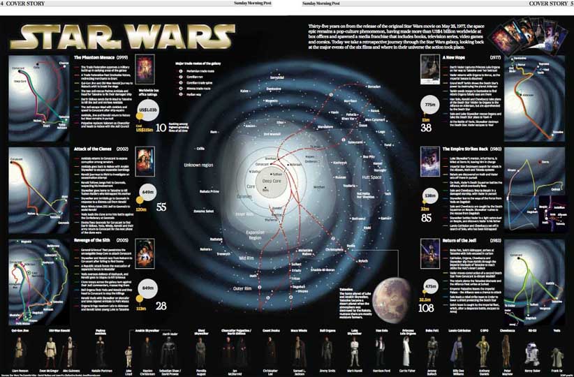
Inside, Simon Scarr, with the help of Brian Wang, did a fantastic graphic on the subject. They drew the 'Star Wars galaxy' then showed plot timelines in relation to different areas around this galaxy. V clever and looked fantastic.
Subscribe to:
Posts (Atom)


